LOGO DESIGN · VISUAL IDENTITY
KSP: a logo family for four identities
KSP Group, KSP Events, KSP Pool and KSP Gym: four published designs connected by a shared visual foundation.
About the project
The KSP collection in Cobalt’s portfolio brings together the group identity and three distinct names: Events, Pool and Gym. It is an example for a brand that needs to be recognised in several contexts, while retaining a visible connection between its different activities.
Cobalt’s contribution
- KSP Group logo.
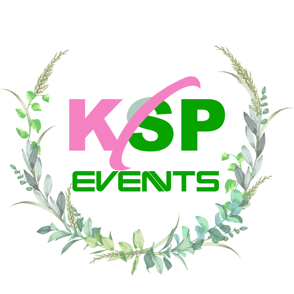
- KSP Events design.
- KSP Pool design.
- KSP Gym design.



The common element
The KSP letters and the curved shape crossing the mark appear in all four designs. This repetition provides a visual connection between the names. The activity name remains separate, allowing Group, Events, Pool and Gym to be identified within the same family.
Distinguishing the designs
The Group version focuses on the core mark and name. Events adds a botanical composition; Pool introduces water shapes and blue; Gym uses a barbell image. These elements make each activity’s context visible without replacing the shared structure entirely.
What this visual family demonstrates
The four examples let you compare a main logo with its related designs. Look at what repeats, what changes and how much space is given to the activity name. This is a useful analysis before a project involving several services, departments or sub-brands.
The published work
Planning an identity with several designs
We start with the names, how they relate to each other and where the identity will be used. We then define which elements should remain common and where differentiation is needed. The number of designs and final materials are set out in the project proposal.
Services for a similar project
What would you like to build?
Tell us who the project is for and what people need to do with it. We can use these examples to discuss the structure, visual design and functionality you need.